About Helpshift
Helpshift enabled support teams at Microsoft, Supercell, and Tencent Games to help over 600 million users monthly. The growing number of conversations coupled with the diverse user base led us to focus our efforts on making our UX more inclusive and accessible. I was leading the design efforts for making Helpshift SDKs accessible across all platforms.
Goals of this exercise
- Adding accessibility to all our existing SDKs
- Work with OS-level accessibility tools: Talkback, VoiceOver, tooltips
- Educating fellow designers about accessibility
- Establishing accessibility processes for design and engineering
Adding accessibility to all our existing SDKs
Accessibility means all text is readable, all elements have the right labels and all the user flows are usable by all. I referred to W3C Compliance for the basic requirements and recommendations for font size and contrast ratio.
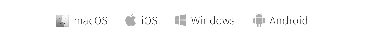
Working with Talkback & VoiceOver
Most of the devices today have an accessibility tool which reads out a description of everything happening on your screen. You get Talkback on Android and VoiceOver on iOS and macOS.
Defining actions and labelling them right
Accessibility tools use these labels to help users by reading it out. With the accessibility practice we had to add correct labels to provide the same experience to all humans.
Defining core user flows
The elements which don’t have to be part of the accessibility flow. Each flows had to be drawn out and then strategic add labels and make elements part of accessibility flow.
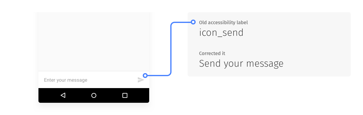
Previous labels were not contextual therefore they didn't help people with Talkback feature
Educating fellow designers about accessibility
Helpshift had a design team of 6 product designers. To get inclusive mindsets we had to have equal knowledge of do’s and don’ts of accessibility. I was given the responsibility of creating awareness of the need to think about accessibility and how can we do our best to be more accessible.
Conducted sessions detailing the need to focus on accessibility and what are the tools we would need to design for (Talkback and VoiceOver)
Establishing accessibility processes for design & engineering
The next step for accessibility efforts at Helpshift was to add accessibility practices to the design process and prepare developers for what to expect with upcoming features.
- A redefined colour palette for eliminating all the colours with bad contrast ratios
- Adding labels to any new UI elements you use
- Using text styles recommended by respective OS (used Material design and Human Interface Guidelines for most of it)
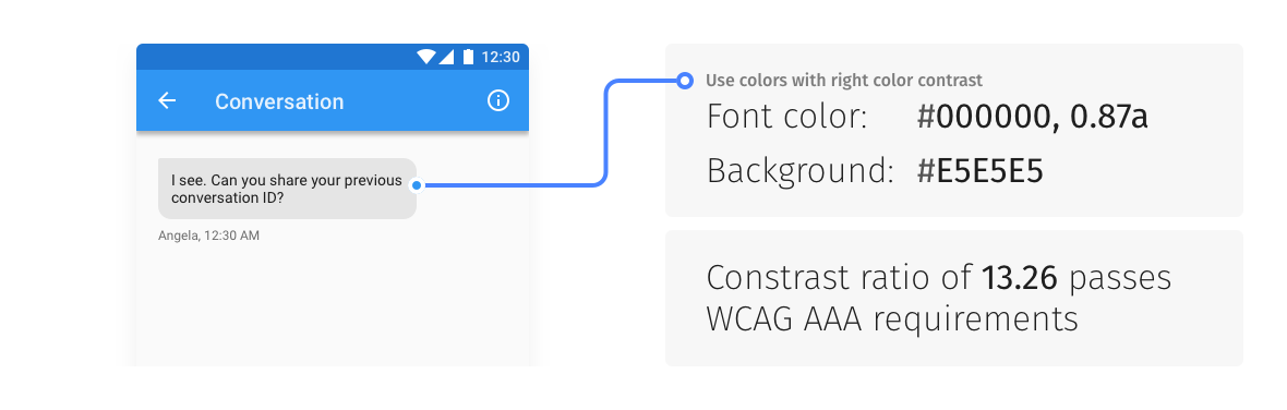
Maintain color contrasts: Legible text contrast for all age groups
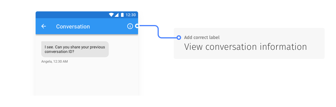
Add contextual labels: Example taken from Helpshift Android SDK
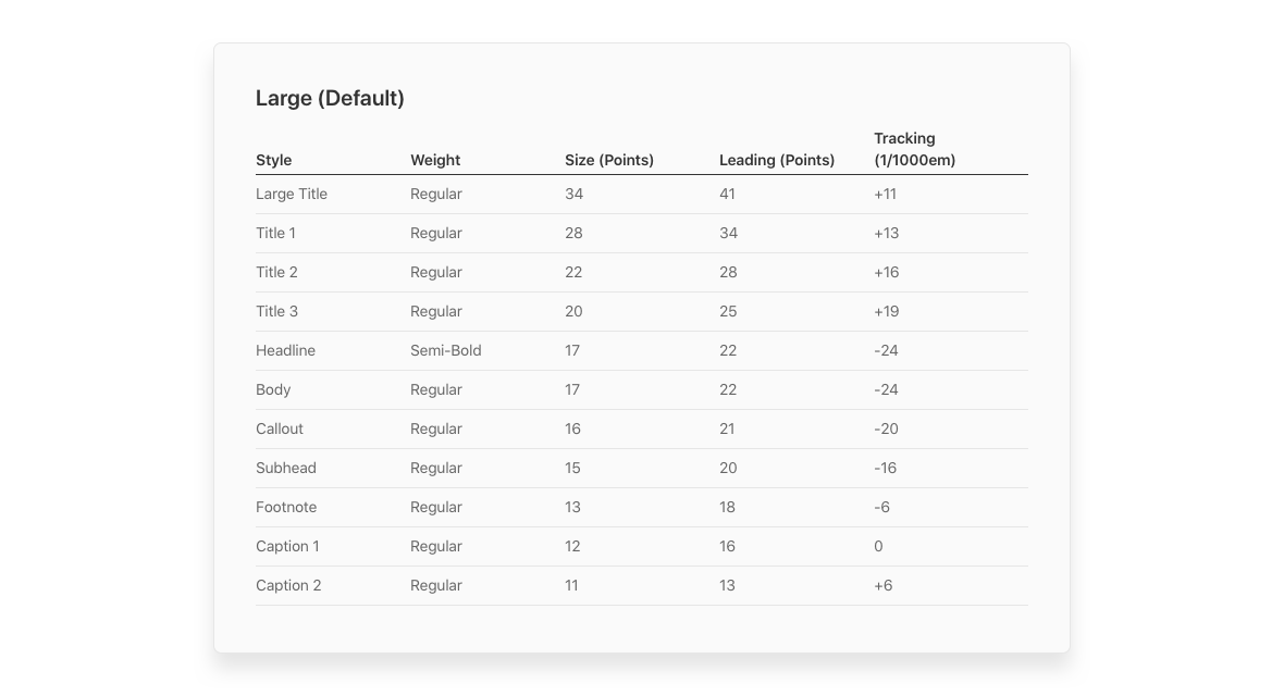
Use system fonts: This one was taken from Apple's HIG documentation
Takeaways and lessons learnt
I found this project interesting for the reason there was so much to learn about peripherals of design and reading best practices and industry standards of accessibility.
Things I learned
- The need for accessibility at scale
- The current state of accessibility tools on Android, iOS & macOS
- The engineering aspects of accessibility
What's next?
- Building features and interactions with accessibility in the design process
- Complying with the accessibility standards for all future platforms