About Helpshift
Helpshift enabled support teams at Microsoft, Supercell, and Tencent Games to help over 600 million users monthly. The next challenge for me in mobile and desktop SDK team was to, create consistency for all projects. I decided to own the design system for mobile SDKs and started off this exercise in early 2017.
Goals of this exercise
The primary goal of this exercise was to design a system which would help bring consistency in future SDK projects.
- Refreshing UI for Android SDK
- Design system for future design projects
- Enabling customisability for new components and updating developer docs
Designing a system for consistency
Helpshift’s design strategy was to provide native experience. This design system would start off as a style guide and then grow into a design system. The way I envisioned this to progress is,
- Colours and typography
- UI elements and components
- Adding usage docs for UI elements and components
- Writing (starting off with tone for error messages)
Colours and typography
Helpshift's native experience demanded the SDK to be updated with the best practices of each platform. With that in mind, we were using the color palette recommended by Material design (Android) and Human Interface Guidelines for iOS, and macOS.
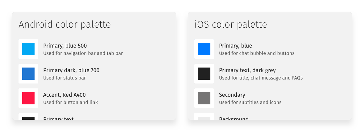
The original sketch file contained more detailed colour palette with various shades ranging from light backgrounds to dark accented text
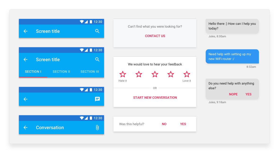
UI elements and components
Existing UI elements and components were plain layers and shapes. These had to converted to Sketch symbols and it's usage, specifications and examples had to be documented for better design collaboration.
Before a central document, design team shared Sketch files of projects and picked up UI elements from these. This had caused several inconsistencies in design, such as, several greys, paddings, and margins.
The Sketch file was shared via Confluence
Adding usage docs for components
With component specifications, we needed a guiding documentation which would help designers and engineers onboard and understand each component when using it.
This document was created on our existing knowledge base, Confluence. This document covered details like,
- How do you customise a component’s colours and other specifications
- Landscape-orientation behaviour
- Events tracked for a particular component
- An example from our existing use-case
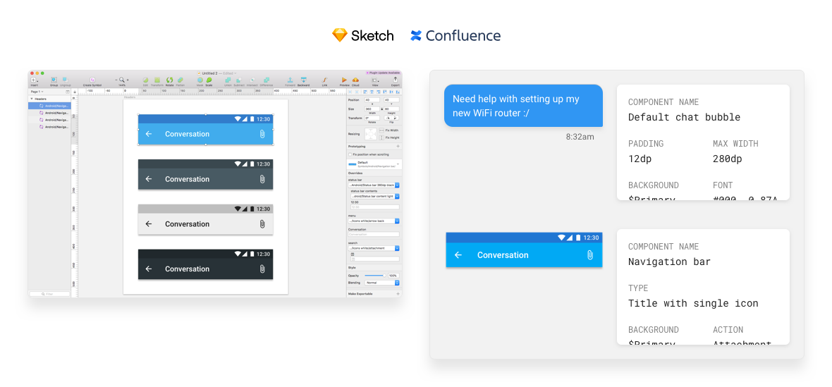
All master Sketch file, color palette and components were documented on Confluence
Writing
The content was all across the SDK. Content like, “Was this helpful?” and “Yes, I’m in”. Similar to our native UI this was packed as the default setup. Therefore we needed some consistency here as well. Simple content corrections like, changing British English to American English across all SDKs and Helpshift Dashboard experience.
Along with making existing messaging consistent, I wrote a little writing guide for error messages. This guide will be help the team write better error messages for experiences. This was heavy inspired by writing guidelines published by Google and MailChimp.
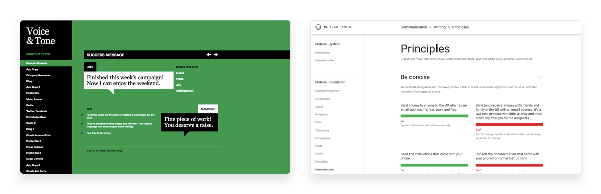
Documentation done right by Google and MailChimp
Customisations and developer docs
While updating old components we discovered several components were not customisable and had been rogue. We added the ability to customise these components with the style guide exercise and published changes to Helpshift Developer Docs.
The support and success team closed several customisation requests with this update to developer docs.
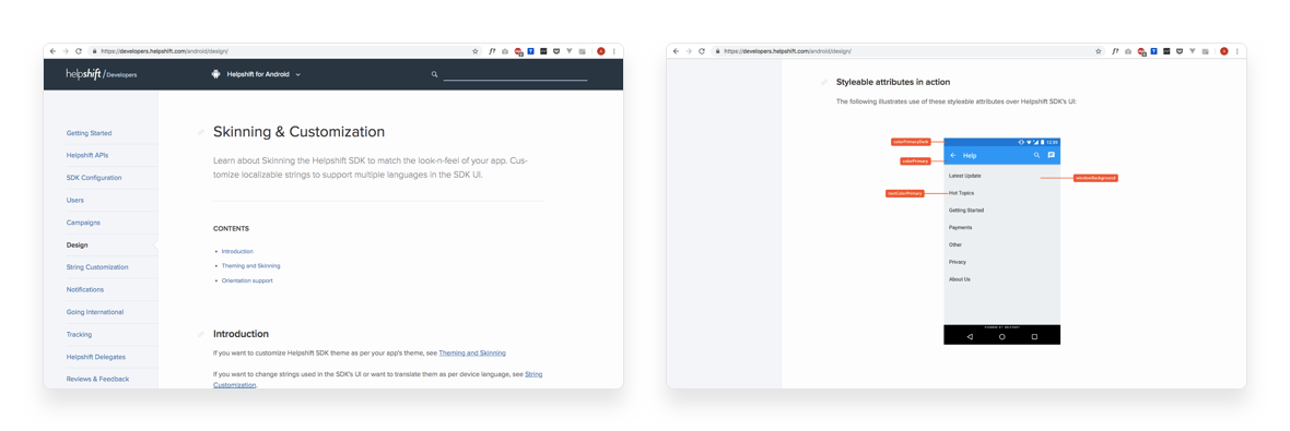
Developer documentations were updated with latest design customisations
Impact of this exercise
- Design and engineering collaboration was easier with UI elements was documented along with its usage
- Existing designs were now consistent with the native UI across all SDKs
- Components now had more customisations which means more control over design for our customers
What's next?
- Adding UI animations as part of the style guide
- Writing advanced guidelines for UX copy across SDK and dashboard
- Exporting this style guide to Invision Craft Library for smoother sharing (Now Sketch Library)