Convertfly is a Messenger marketing app built for Shopify
About Convertfly
Convertfly is a Messenger marketing app built for Shopify. Convertfly’s main target audience consisted of people who are not marketers but people selling stuff they craft (some do drop-shipping).
UX Problems
Reaching the wow was a long way
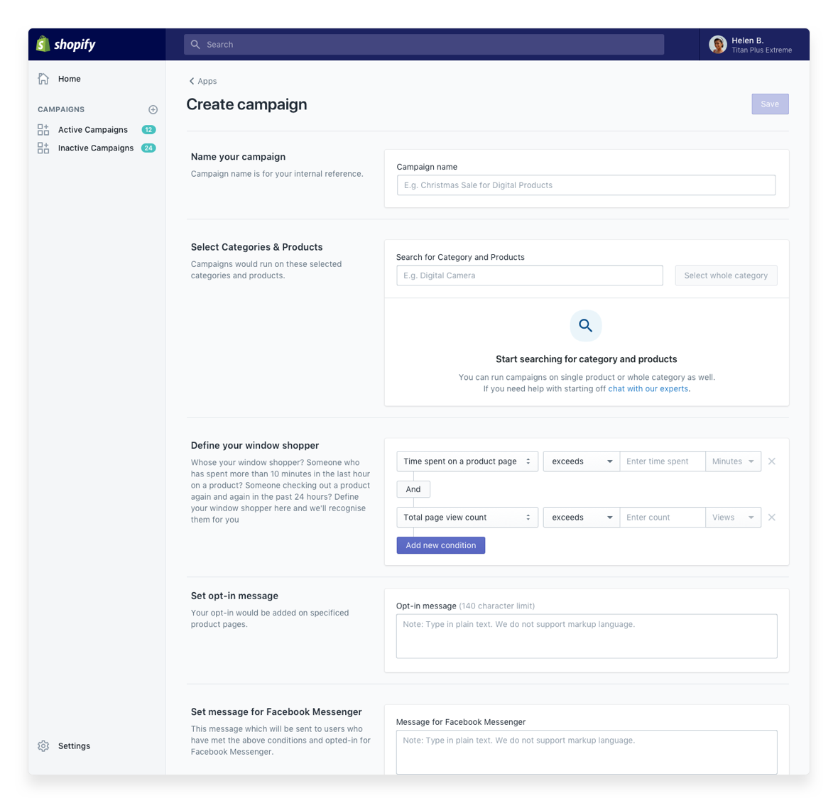
The wow moment needed users to set up tedious campaigns and wait for results. Setting up campaigns was a very open-ended experience.
Making new campaign needs many decisions
Along with long forms, there was little to no education on best practices.
Redesigning whole experience
We built the first version, we had little understanding of a typical Shopify store owner. This resulted in a product which didn’t expect their level of simplicity and ease.
Older experience was confusing to most of the Shopify store owners
Target Audience
People with Shopify stores and those looking for new marketing channels. Two main goals of these users would be to,
- Recover abandoned carts through a channel with better open rates than email
- Engaging customers and selling their products in conversations
- Experiment with new sales and marketing channels
User Research
- Talked to existing customers and interested people
- Remotely conducted UX testing
- Watched user sessions on Fullstory
Top takeaways from the research
- Shopify store owners do not have enough time for marketing. They explicitly asked for one-click solutions.
- They do not understand most of the marketing terminologies. Most of the Shopify store owners are not tech-savvy.
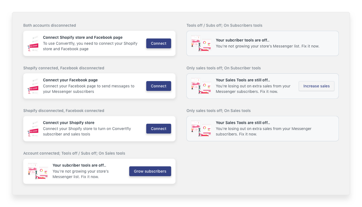
- They carry subtle anxiety when you ask them to connect Facebook to any other tool. Most of their business came in from Facebook Ads. If an app were to cause a problem with Facebook, Facebook could block their Facebook page.
UX Solutions
We split design solutions into three major features
- Templates or default campaigns which will reduce decisions and make it easy to get started. MailChimp, OptinMonster and several other marketing tools were doing this already.
- Work on messaging using keywords from Shopify’s guidelines, and avoiding using words from our B2B SaaS vocabulary.
- Adding preview interaction for each campaign. They could see how campaign looked before they enabled it or connected their Facebook account.
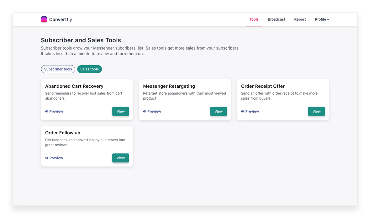
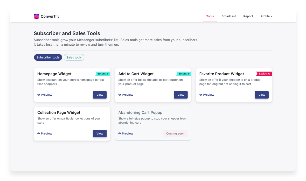
Homepage: Providing one-click campaigns (almost) instead of custom campaigns
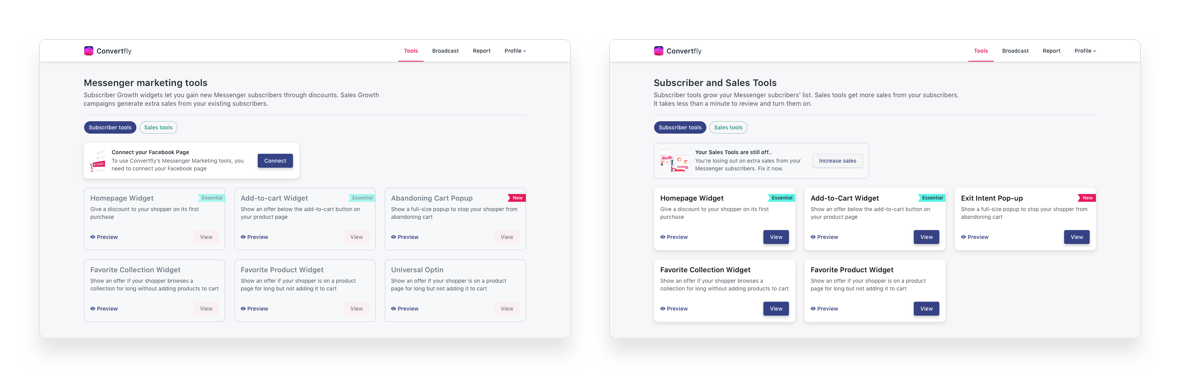
Homepage for first time user: Onboarding notifications were right in the explore page where users could go check out campaigns and then wrap up the setup
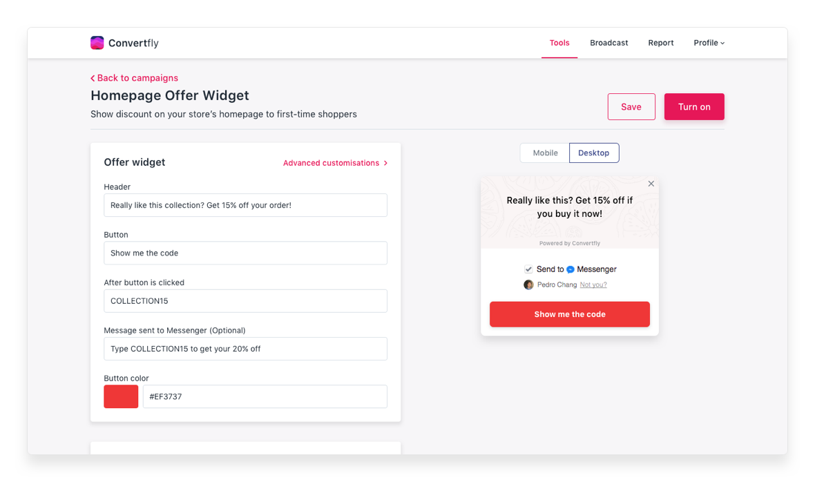
Campaign editor for subscriber widgets: We added defaults for each campaign to make it almost easy to get started with Converfly
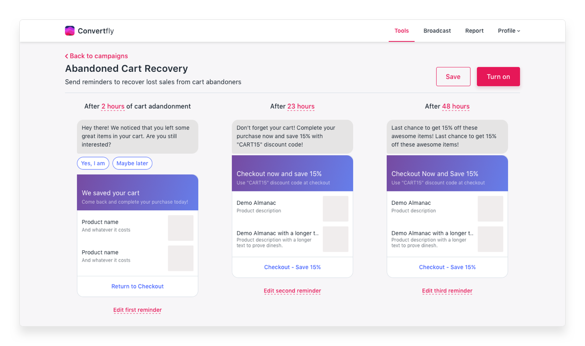
Campaign editor for Messenger campaigns: Laid down messages left to right to match most LTR readers' expectations of sequence
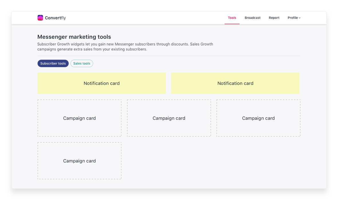
Layout for Notification and campaign cards: This layout could accomodate most of our notifications and onboarding messages
Notification cards: Each notification had a title, description and an icon and CTA were omitted for non-actionable messages
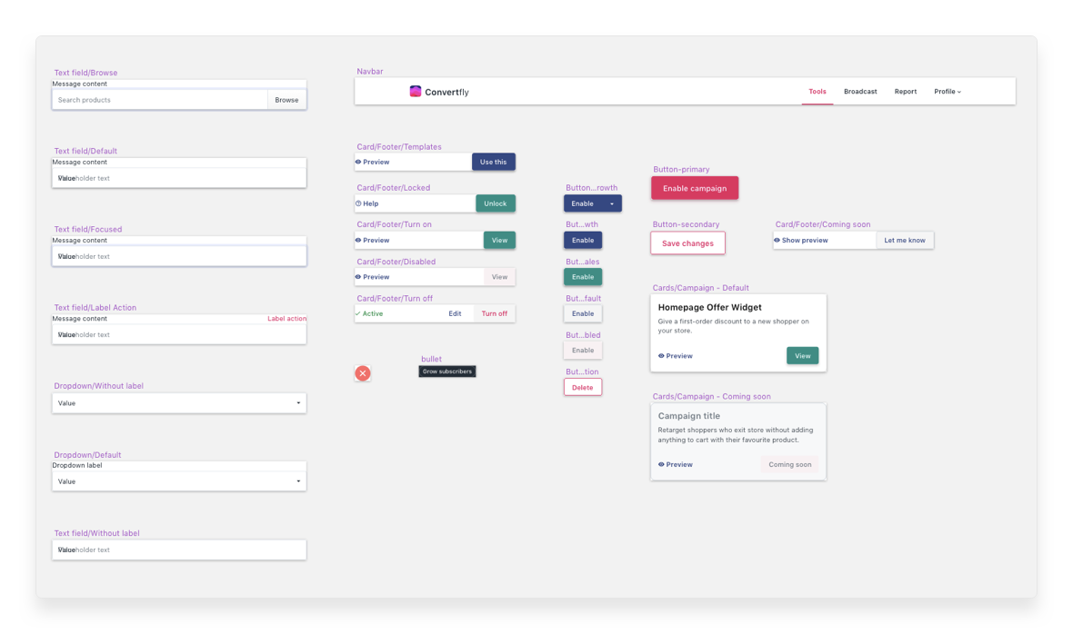
Behind the scenes: Most of the reusable elements were converted to adaptive Sketch symbols
Metrics
- We had more users turning on more campaigns. New stores turned on first campaigns in the first session itself.
- In majority user recordings, we saw our users hitting preview before connecting their Facebook page. Preview allowed them to understand the app better and then connect if app fits in with their marketing ideas.
- Onboarding helped onboarding users and helped with setting up campaigns right.
What's next?
- Talk to more customers and getting feedback on the product
- Work on adding more campaigns without making decision making complex
- Adding more control over each campaign, for example, sending messages only during business hours